What is Infographics?
A comprehensive guide to understanding infographics, their impact, and how to create them effectively using modern tools and best practices.
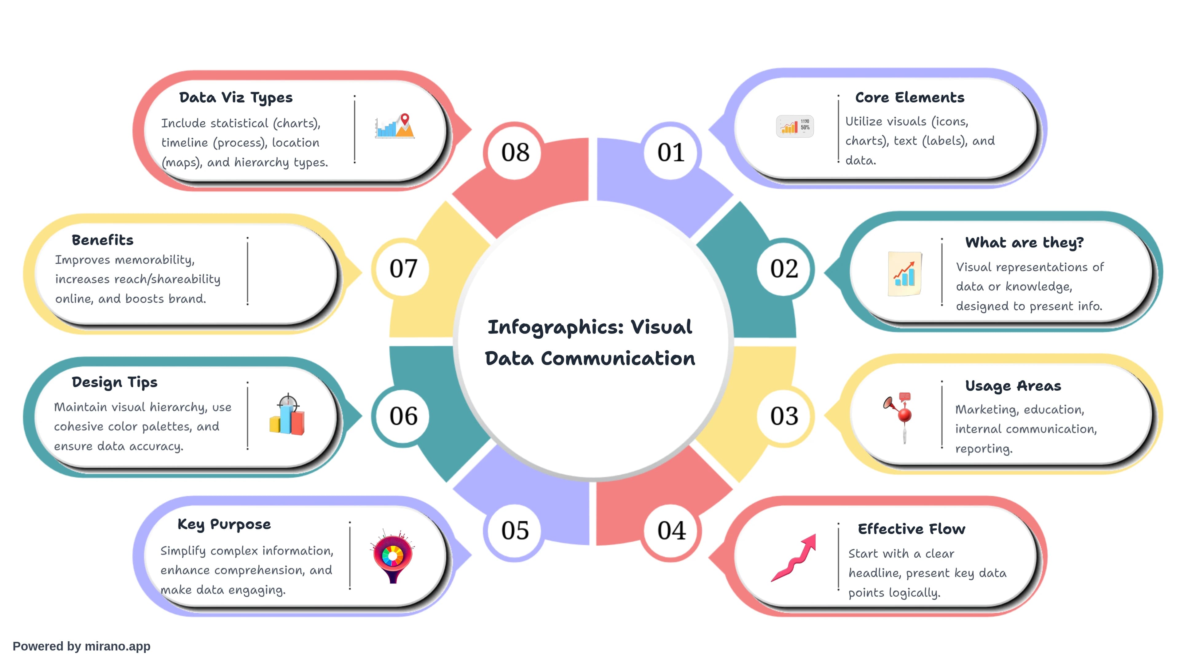
Infographics are visual representations of information, data, or knowledge intended to present complex information quickly and clearly. They combine graphics, text, and data to tell a story or explain a concept in an engaging and easily digestible format.
What is the Purpose of Your Infographic?
Before creating an infographic, it's crucial to define its purpose. Infographics serve various objectives:
To Educate
Teach your audience about a new concept, process, or topic in a simplified visual format that enhances understanding.
To Inform
Share important data, statistics, or research findings in a way that's quick to consume and easy to remember.
To Persuade
Convince your audience of a viewpoint or call them to action using compelling visuals and supporting data.
To Entertain
Engage viewers with fun, interesting facts or stories presented in an entertaining visual style.
What are the 5 Elements of an Infographic?
1. Story
The narrative or message you want to convey. Every infographic should tell a clear story with a beginning, middle, and end.
2. Data
The factual information, statistics, or research that supports your story. Data gives credibility and substance to your infographic.
3. Design
The visual layout including color scheme, typography, spacing, and overall aesthetic. Good design makes information accessible and appealing.
4. Visuals
Icons, illustrations, charts, graphs, and images that help visualize your data and story. Visuals should clarify, not clutter.
5. Knowledge
The expertise or insight that makes your infographic valuable. This includes your unique perspective, analysis, or actionable takeaways.
What are the Four Parts of an Infographic?
Structurally, effective infographics typically consist of four main parts:
Header/Title
A compelling headline that grabs attention and clearly states what the infographic is about. Should be concise and descriptive.
Body/Content
The main visual content area where data, information, and graphics are presented in an organized, logical flow.
Citations/Sources
References to where your data comes from, adding credibility and allowing readers to verify information.
Footer/Branding
Your logo, website, or call-to-action. This identifies the creator and provides next steps for interested viewers.
What are the 7 Common Types of Infographics?
1. Statistical Infographics
Perfect for presenting survey results, research findings, or data-heavy content. They use charts, graphs, and bold statistics to make numbers more digestible. This is one of the most popular infographic types for businesses and researchers.
Best Used For:
Market research, survey results, annual reports, data-driven stories
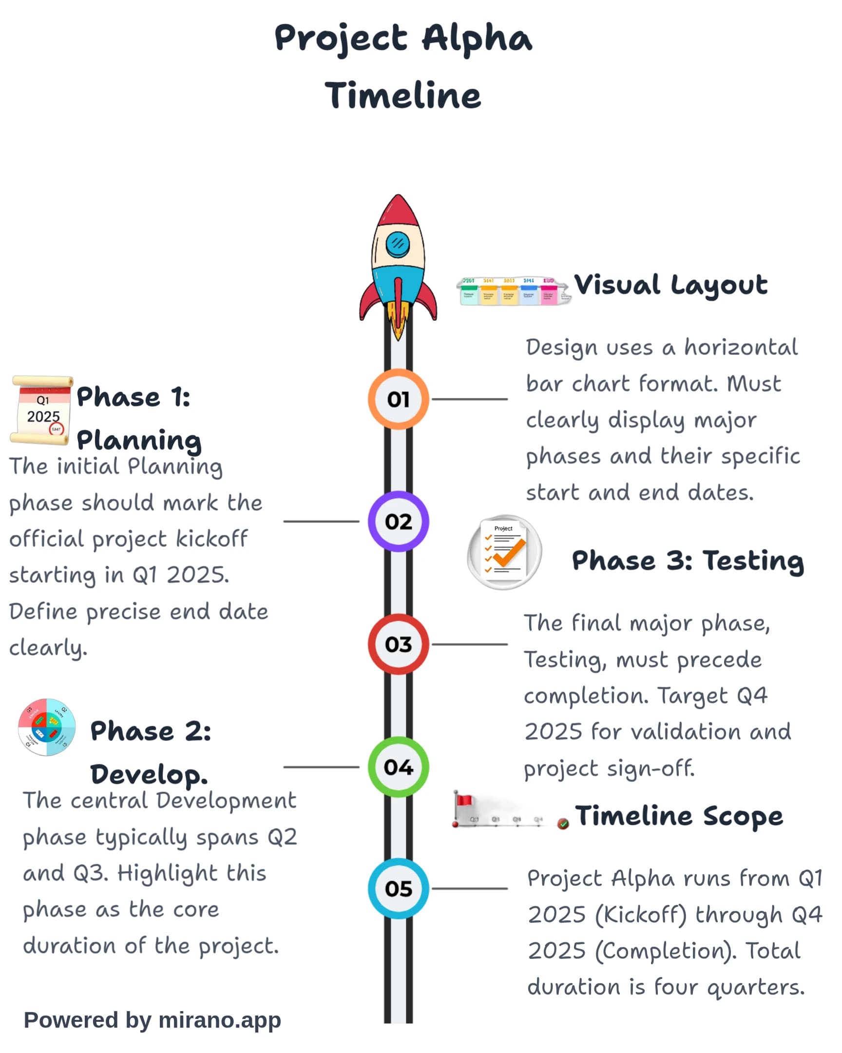
2. Timeline Infographics
Ideal for showing the evolution of something over time, historical events, or project milestones. They provide a clear chronological flow that helps audiences understand progression.
Best Used For:
Company history, product evolution, historical events, project roadmaps
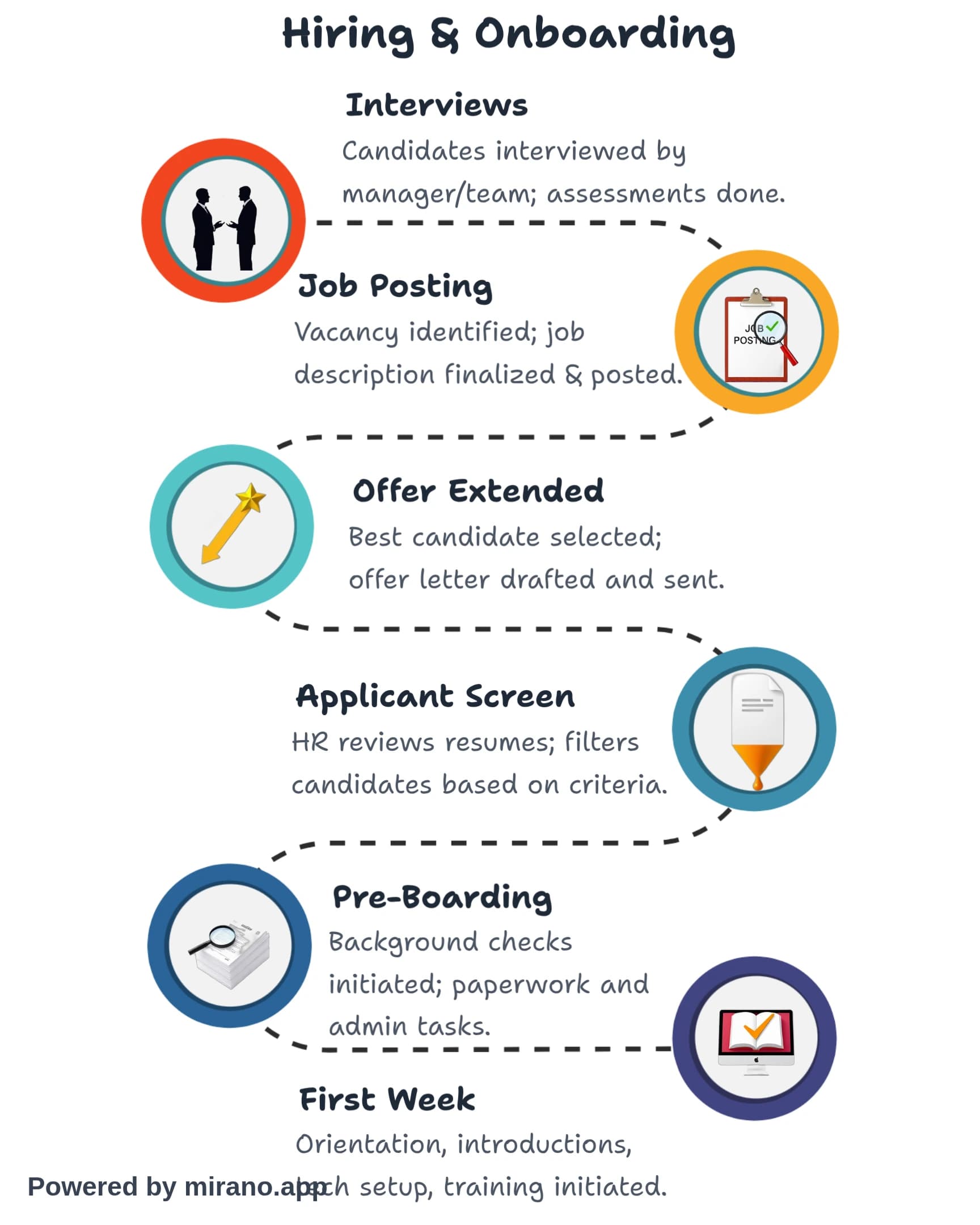
3. Process Infographics
Used to simplify and clarify a complex process or workflow. They break down information into clear, sequential steps with directional flow, making them perfect for tutorials and how-to guides.
Best Used For:
How-to guides, workflows, step-by-step instructions, procedures
4. Comparison Infographics
Helps viewers understand the differences and similarities between two or more options, products, or concepts side by side. Excellent for decision-making content.
Best Used For:
Product comparisons, pros vs cons, before and after, option analysis
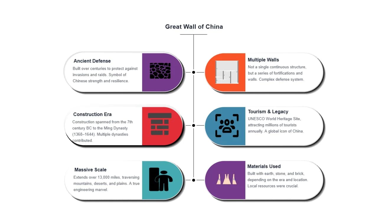
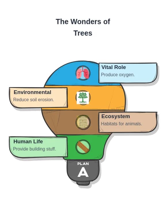
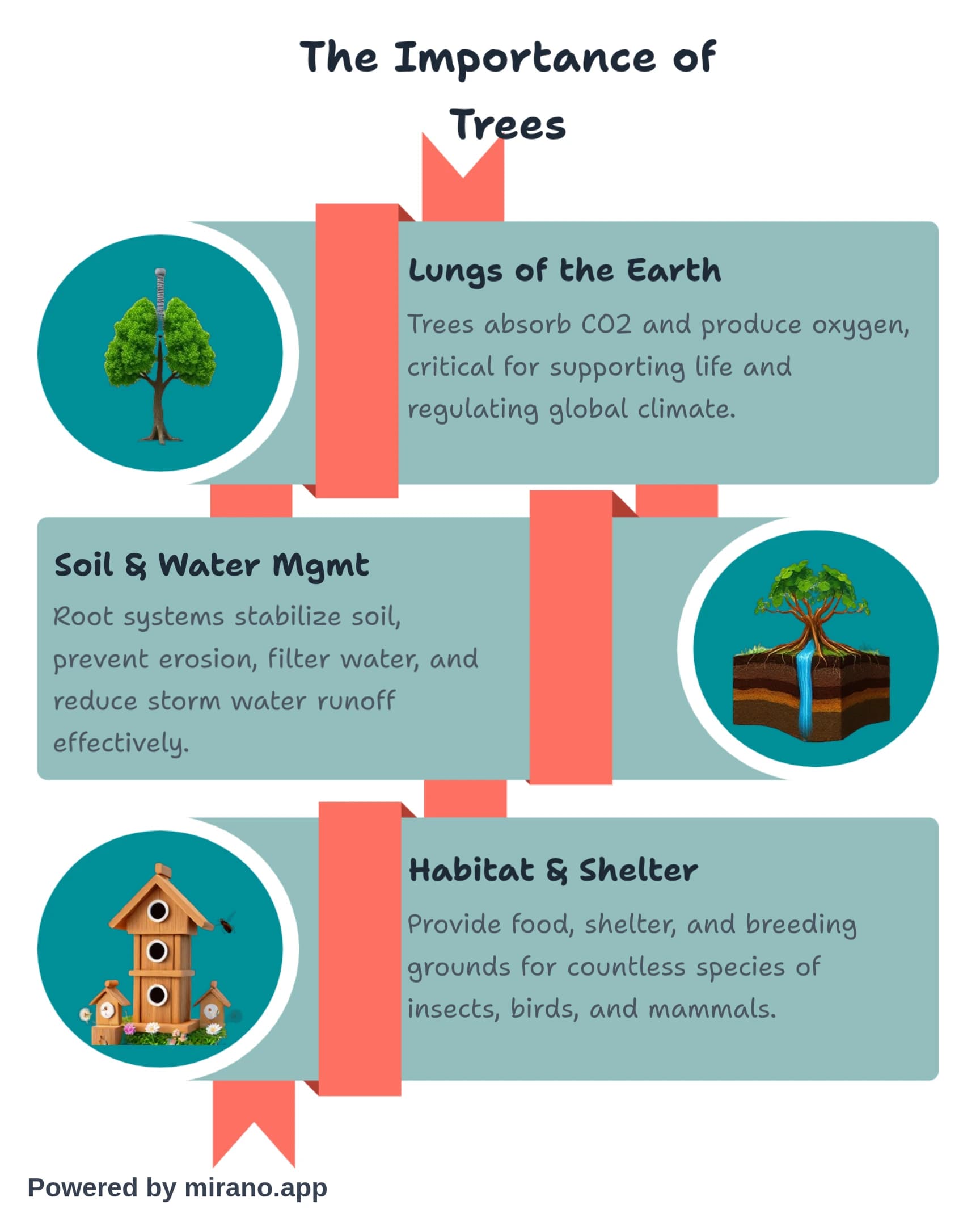
5. Informational Infographics
Designed to communicate a new or specialized concept clearly. They typically include descriptive headers, numbered points, and supporting visuals. Great for educational content.
Best Used For:
Educational content, tips and tricks, overviews, introductions to topics
6. Flowchart Infographics
Use flowchart based demographical data. They're excellent for visualizing regional statistics, global trends, or any process-specific information.
Best Used For:
Workflow statistics, STep by step information, Linear trends
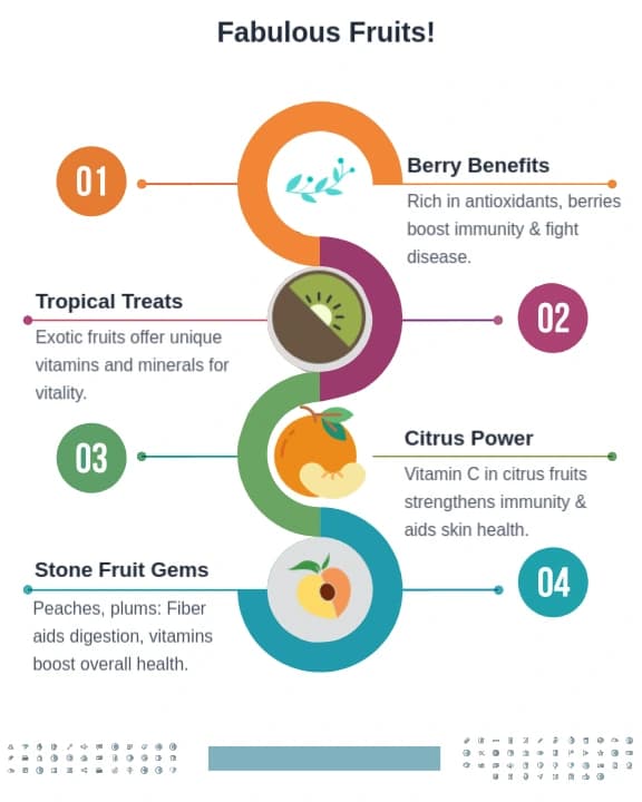
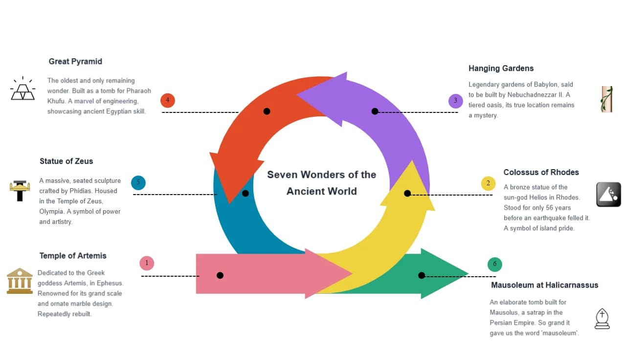
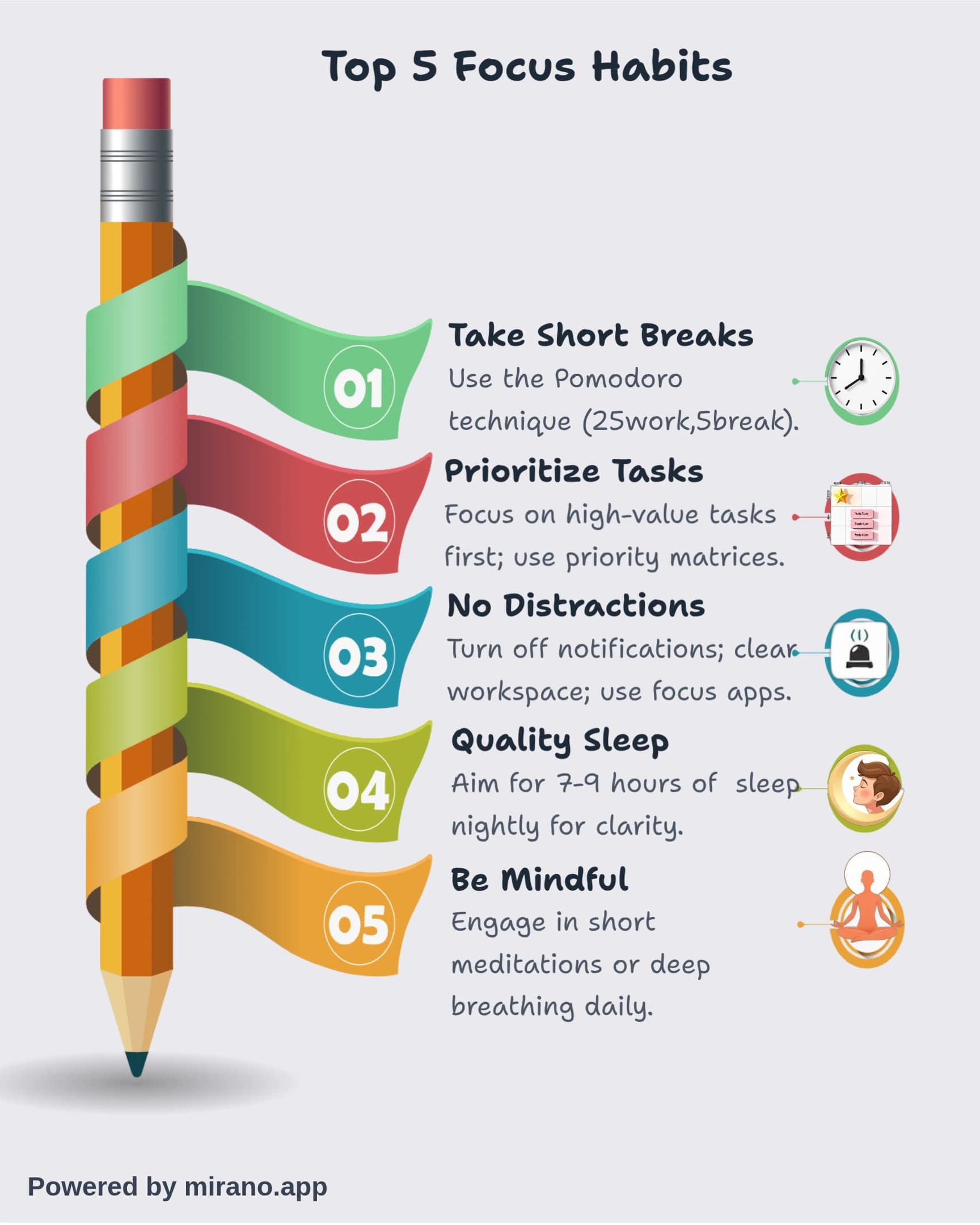
7. List Infographics
One of the most popular formats, list infographics present information in a numbered or bulleted list format with accompanying visuals. They're easy to scan and highly shareable.
Best Used For:
Top 10 lists, collections of tips, resource roundups, checklists
What are the 5 Basic Types of Charts or Graphs?
When creating data-driven infographics, choosing the right chart type is crucial for clear communication. Here are the five most essential chart types:
1. Bar Charts
Compare quantities across different categories. Can be horizontal or vertical. Perfect for showing rankings or comparing discrete items.
Example: Sales by product category, survey responses by age group
2. Line Charts
Show trends over time with continuous data points connected by lines. Ideal for displaying changes and patterns across time periods.
Example: Stock prices over a year, website traffic trends, temperature changes
3. Pie Charts
Display parts of a whole as percentages. Best used with 3-6 categories where proportions need to be compared to 100%.
Example: Market share distribution, budget allocation, demographic breakdowns
4. Scatter Plots
Show relationships between two variables by plotting data points on x and y axes. Great for identifying correlations or clusters.
Example: Height vs weight relationships, price vs demand correlations
5. Area Charts
Similar to line charts but with the area below the line filled in. Emphasizes magnitude of change over time and can show cumulative totals.
Example: Cumulative sales, stacked categories over time, volume comparisons
What are the 7 Steps in Creating an Infographic?
Follow this proven seven-step process to create effective, professional infographics:
Define Your Goal and Audience
Identify what you want to achieve and who you're creating this for. Understanding your audience shapes every decision that follows.
Collect and Verify Data
Gather relevant, accurate information from credible sources. Ensure all statistics and facts are current and properly cited.
Create Your Story Structure
Outline the narrative flow. Organize information logically with a clear beginning, middle, and end that guides viewers through your message.
Choose Your Infographic Type
Based on your content and goal, select the most appropriate format (statistical, timeline, process, comparison, etc.).
Design Your Layout and Visuals
Create a wireframe, choose colors and fonts, then design your visuals. Focus on hierarchy, balance, and making data easy to understand at a glance.
Add Text and Refine
Write concise, impactful copy. Edit ruthlessly to keep only essential text. Ensure proper citations and branding are included.
Review and Optimize
Check for accuracy, readability, and visual appeal. Test on different devices, get feedback, and make final adjustments before publishing.
Which Tool is Best for Creating Infographics?
The best tool depends on your needs, budget, and design experience. Here's a comprehensive look at the most popular options:
Can Mirano Create Infographics?
Yes! Mirano is one of the most finest tools for infographic creation. It offers:
- ✓Thousands of pre-made infographic templates
- ✓Customizable (beginner-friendly)
- ✓Free plan with extensive features
- ✓Charts and data visualization tools
- ✓Mirano AI features for generating design elements
Best for: Beginners, small businesses, quick projects, social media infographics
Can ChatGPT Create Infographics?
Partially. ChatGPT can assist with infographic creation but has limitations:
What ChatGPT CAN Do:
- ✓ Generate content and copy
- ✓ Organize information structure
- ✓ Suggest color schemes
- ✓ Create data for charts
- ✓ Provide design recommendations
- ✓ Generate simple SVG graphics
What ChatGPT CANNOT Do:
- ✗ Create complex visual designs
- ✗ Generate high-quality images
- ✗ Produce print-ready graphics
- ✗ Design polished layouts
Best for: Brainstorming, content planning, quick mockups. Use with design tools for final output.
Is There an AI That Can Create Infographics?
Yes! Several AI-powered tools now create complete infographics:
Mirano
Generate infographic layouts from text prompts
Canva AI
AI-powered infographic generator with smart templates
Piktochart AI
Creates infographics from data and text descriptions
Vennege AI
AI-assisted design with smart templates
Best for: Quick generation, exploring design options, non-designers who need professional results
Can ChatGPT Create Visuals?
With DALL-E integration, yes! ChatGPT Plus users can generate images through DALL-E, but with important limitations for infographics:
- ⚠Good for conceptual illustrations and icons
- ⚠Limited text rendering capabilities
- ⚠Cannot create precise data visualizations
- ⚠Best used for decorative elements, not complete infographics
Recommendation: Use ChatGPT for planning and individual visual elements, then assemble in proper design software.
Other Popular Infographic Tools:
Adobe Illustrator
Professional, full control, steep learning curve
Visme
Interactive infographics with animation options
Piktochart
User-friendly with good chart tools
Infogram
Data-focused with real-time chart updates
How to Write an Infographic? How Do I Create My Own Infographic?
Creating your own infographic combines writing, design, and data visualization. Here's a practical guide:
Writing Your Infographic Content
- 1.Start with a compelling headline: Make it clear, concise, and benefit-focused (10-15 words maximum)
- 2.Use the 30/70 rule: 30% text, 70% visuals. Every word must earn its place
- 3.Write in chunks: Use short sentences, bullet points, and headers to break up information
- 4.Focus on one key message: Don't try to communicate everything. Stay focused on your main point
- 5.Include a clear CTA: Tell viewers what to do next (visit website, share, download, etc.)
Design and Creation Process
- 1.Choose your tool: Mirano (easiest), Piktochart, Visme, or Adobe Illustrator (advanced)
- 2.Select or create a template: Start with a template matching your chosen infographic type
- 3.Establish visual hierarchy: Make the most important information largest and most prominent
- 4.Apply consistent styling: Use 2-3 fonts maximum and a cohesive color palette (3-5 colors)
- 5.Test readability: View from a distance. Can you understand it in 5 seconds? If not, simplify
Best Practices for Creating Infographics
Use Consistent Colors
Stick to a cohesive color palette (3-5 colors) that aligns with your brand and improves readability. Use color psychology to reinforce your message.
Keep Text Minimal
Use concise copy and let visuals do the heavy lifting. Aim for 30% text and 70% visuals for optimal engagement and comprehension.
Visualize Data Clearly
Choose the right chart type for your data and make sure it's easy to interpret at a glance. Label everything clearly.
Tell a Story
Create a logical flow that guides viewers through your content from beginning to end with a clear narrative arc.
Design for Mobile
Ensure your infographic is readable on small screens. Use vertical layouts and large, clear text.
Cite Your Sources
Always include sources for statistics and data. This builds credibility and allows verification of information.
What is the Most Popular Infographic Type?
Statistical Infographics
Statistical infographics are consistently the most popular and widely shared type. They excel at making data-heavy content accessible and engaging.
67%
of marketers use statistical infographics
3x
more shares than other content types
94%
increase in views with data visuals
Why they're popular: Statistical infographics combine credibility (data-backed), shareability (people love sharing interesting stats), and visual appeal. They're perfect for annual reports, research findings, survey results, and educational content. The second most popular types are list infographics and timeline infographics, followed closely by process infographics.
Conclusion
Infographics are powerful tools for communication in our visually-driven world. Whether you're presenting complex data, explaining a process, or telling a story, infographics can help you convey your message more effectively and memorably. With modern tools like Mirano, AI-powered generators, and even ChatGPT assistance, creating professional infographics is more accessible than ever.
By understanding the different types of infographics, following the seven-step creation process, and applying best practices, you can create compelling visual content that engages your audience and drives your message home. Remember: the best infographics balance aesthetics with functionality, making information not just beautiful, but truly accessible.
Start with a clear purpose, choose the right type for your content, use appropriate tools, and don't forget the fundamentals—good data, clear storytelling, and thoughtful design. Whether you're using AI tools or designing from scratch, these principles will guide you to create infographics that inform, engage, and inspire action.
Ready to Create Your Own Infographic?
Start transforming your data and ideas into engaging visual stories that capture attention and drive results. Try Mirano, explore AI tools, or dive into professional software—the choice is yours!