Creating Compelling Timeline Infographics That Engage and Inform
Discover the art of visual storytelling with dates. A complete, step-by-step guide to designing timeline infographics that effectively communicate chronological information and turn history into a powerful narrative.
History isn't just a list of dates; it's a story of cause and effect, progress, and change. Yet, when we try to present chronological data in a report, presentation, or blog post, we often default to boring bullet points or dense paragraphs.
There is a better way to visualize time: Timeline Infographics.
A well-designed timeline infographic transforms complex chronological information into a clear, engaging visual narrative. Whether you are mapping out a company's history, illustrating the evolution of a product, or planning a future project roadmap, a timeline is your best tool for clarity.
Why Use Timeline Infographics?
Before diving into the "how," let's briefly touch on the "why." Why should you spend time turning dates into visuals?
Instant Comprehension
The human brain processes visuals 60,000 times faster than text. A timeline allows viewers to grasp the sequence and duration of events instantly.
Improved Retention
People remember stories better than data facts. A visual timeline turns data into a story arc that sticks in the memory.
Shareable Content
Highly visual infographics are far more likely to be shared on social media and embedded in other websites than text-heavy articles.
Step 1: Curate and Define Your Story
The biggest mistake beginners make is trying to include everything. A compelling timeline is not a comprehensive database; it is a curated highlight reel.
Before you open a design tool like Mirano.app, open a document and start filtering your data:
Define the Goal
What is the single main message you want the viewer to take away? (e.g., "Our company has consistently innovated over ten years.")
Identify Key Milestones
Select only the events that support that goal. If you have 50 dates, try to narrow it down to the 10–15 most critical ones.
Gather Supporting Assets
Do you have photos, icons, or specific data points (like revenue numbers) that correspond to these dates? Gather them now.
💡Pro Tip
If your timeline has too many points, consider splitting it into two separate infographics rather than cluttering one. Quality always trumps quantity when it comes to visual clarity.
Step 2: Choose the Right Layout Structure
The structure of your timeline should be dictated by the platform where it will be viewed and the nature of your data.
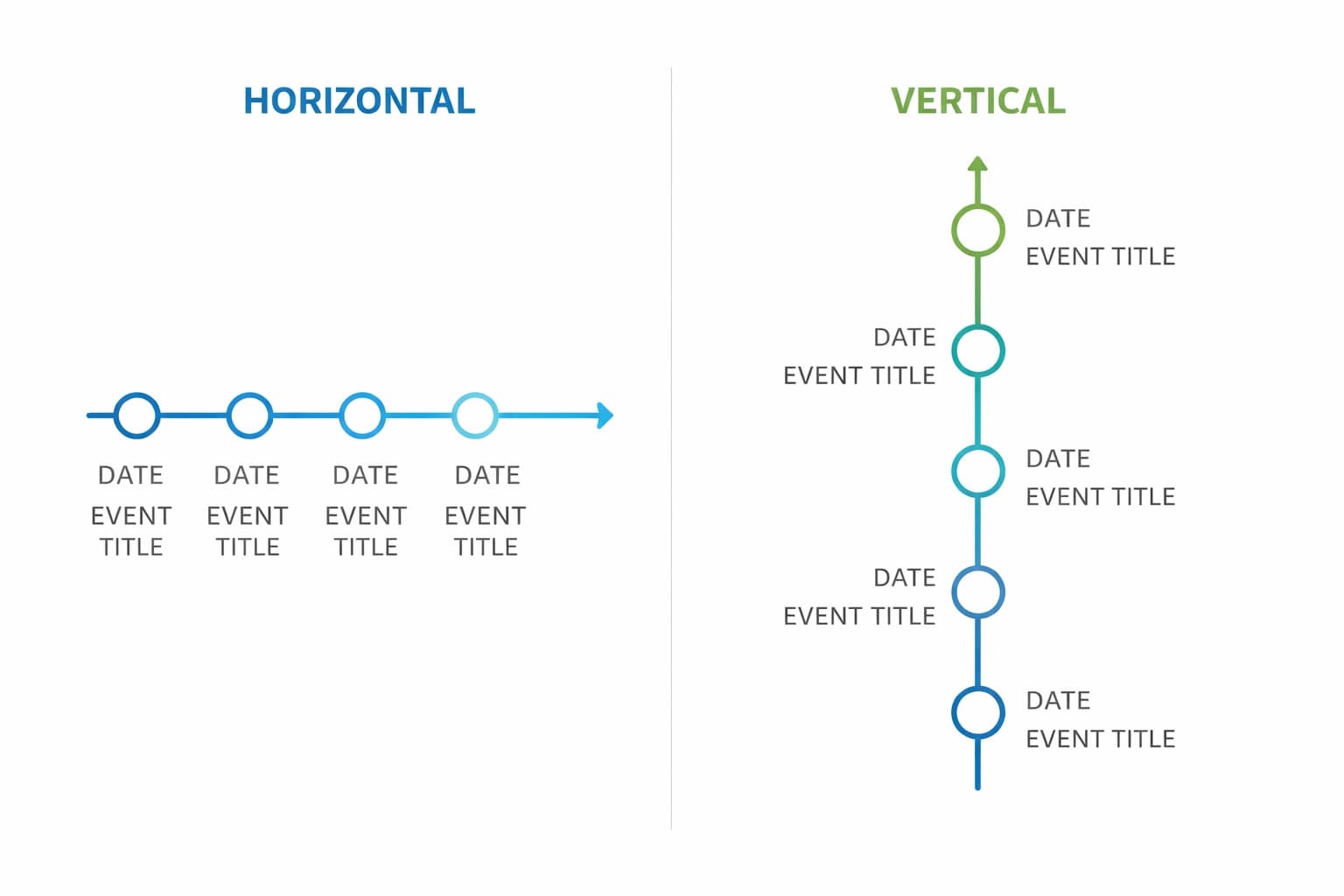
The Horizontal Timeline
This is the classic left-to-right approach. It's intuitive to read and mimics the natural reading direction in Western cultures.
Best for:
- • Presentations (widescreen formats)
- • Desktop website banners
- • Timelines with fewer than 10 milestones
The Vertical Timeline
Events flow from top to bottom, following the natural scroll pattern of modern web pages.
Best for:
- • Mobile-first viewing
- • Blog posts (where users scroll down)
- • Timelines with many milestones
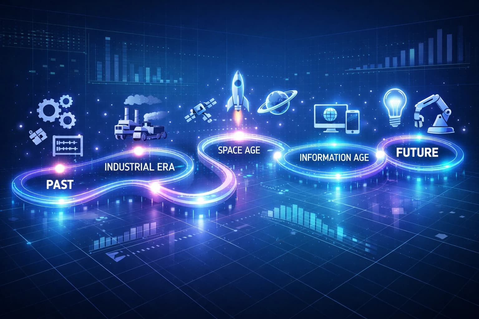
The "Snake" or Winding Timeline
This layout winds back and forth down the page, creating a dynamic visual journey.
Best for:
- • Saving space while including many data points
- • Making the journey feel like a "roadmap" or adventure
- • Creating engaging visual flow
Step 3: Design Principles for Clarity
Once you have your data and your layout, it's time to make it look professional. A compelling timeline relies on a few core design principles.
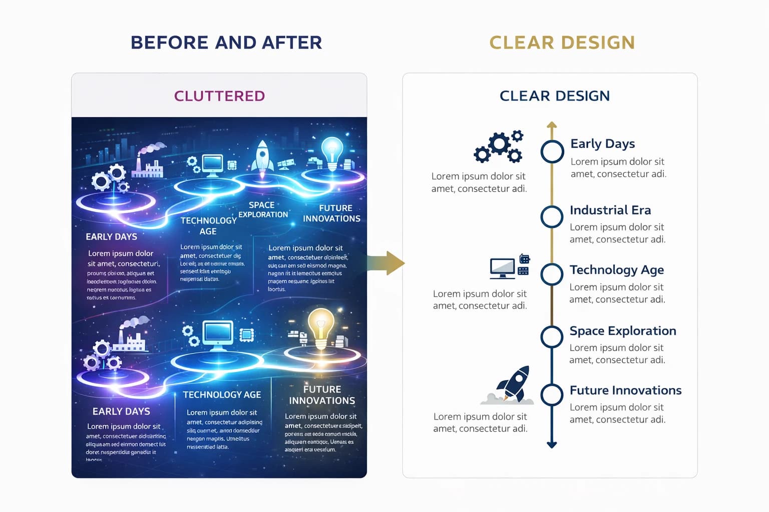
Visual Consistency is Key
Your timeline needs a recurring visual "beat." Use the same shape for every milestone marker (e.g., a circle or diamond). Use consistent fonts for dates and headers.
Example: If your first milestone uses a blue circle with 14pt bold text, every milestone should follow that same pattern. Consistency creates rhythm and reduces cognitive load.
Use Color Coding Strategically
Don't just splash color randomly. Use color to group related events and create visual meaning.
Blue
Product launches
Green
Funding rounds
Orange
Major awards
Let It Breathe (Whitespace)
Clutter is the enemy of comprehension. Ensure there is ample "whitespace" (empty space) around your text and icons.
If events are bunched too closely together, the viewer won't know where to look first. Give each milestone room to breathe, and your timeline will guide the eye naturally from one point to the next.
Step 4: Draft Your Timeline (The Easy Way)
You have your plan. Now it's time to build.
Years ago, creating a timeline required advanced Adobe Illustrator skills. Today, tools like Mirano.app are designed specifically to streamline this process.
When drafting in your tool:
Place your dates first to establish the structure and create the backbone of your timeline.
Add your brief headlines for each event—keep them short and impactful.
Swap out generic template icons for icons relevant to your specific points.
Apply your brand colors to maintain consistency with your overall design system.
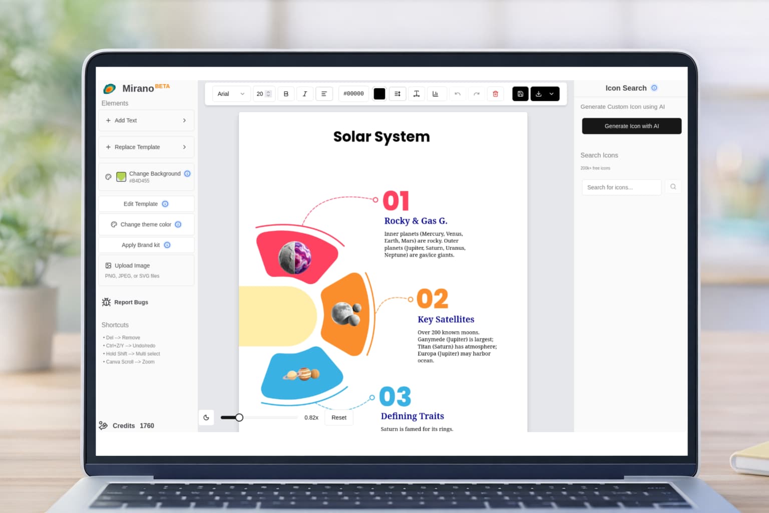
Why Use a Template?
Instead of starting from a blank canvas, you can utilize pre-designed infographic templates. Look for a template that matches your chosen layout (horizontal or vertical). This saves hours of work and ensures your design follows proven best practices.
Step 5: Refine and Polish
Before you publish, take a step back and review your work with fresh eyes. Here are two critical tests every timeline should pass:
The Squint Test
Squint at your screen until the text goes blurry. Does the overall flow still make sense?
What to check: Are the major milestones visually distinct from the minor ones? Can you follow the path without reading the text?
Text Diet
Be ruthless. Can you cut more words? Can a sentence be replaced by a three-word phrase?
Remember: The less text you have, the more impactful your visuals will be. Every word should earn its place.
Final Checklist
- ✓Are dates accurate and in chronological order?
- ✓Is the visual hierarchy clear (important events stand out)?
- ✓Have you removed all unnecessary text and decorations?
- ✓Are colors used consistently and strategically?
- ✓Is there enough whitespace around each element?
Real-World Timeline Applications
Timeline infographics aren't just for history lessons. Here are some powerful use cases across different industries:
Company History
Showcase your company's journey from founding to present day. Perfect for "About Us" pages, investor presentations, and anniversary celebrations.
Product Roadmap
Visualize upcoming features and releases. Great for keeping stakeholders informed and generating excitement for future developments.
Project Timeline
Track project phases, milestones, and deliverables. Essential for project management and client communication.
Event Timeline
Map out conference schedules, wedding timelines, or festival programs. Helps attendees navigate complex multi-day events.
Timeline Design Best Practices
Do This
- ✓Curate your content—show only the most important milestones
- ✓Choose layout based on platform (horizontal for desktop, vertical for mobile)
- ✓Use consistent shapes, fonts, and spacing throughout
- ✓Apply strategic color coding to group related events
- ✓Leave plenty of whitespace for visual breathing room
✗Avoid This
- ✗Including every single date and detail (overwhelming)
- ✗Using random colors without strategic purpose
- ✗Cramming too many events too close together
- ✗Writing long paragraphs instead of concise labels
- ✗Using inconsistent visual styles between milestones
Conclusion
A great timeline infographic doesn't just show when things happened; it explains how things changed. By curating your data carefully, choosing the right layout, and adhering to clean design principles, you can turn dry chronological facts into a compelling visual story.
The difference between a forgettable list of dates and a memorable visual narrative lies in the details: consistent styling, strategic color use, generous whitespace, and most importantly, a clear sense of story. When your timeline guides the viewer's eye naturally from beginning to end, you've succeeded in creating not just an infographic, but an experience.
Whether you're documenting company history, planning future projects, or illustrating historical events, the principles in this guide will help you create timelines that inform, engage, and inspire action.
Ready to Start Designing?
Transform your chronological data into compelling visual stories with Mirano.app. Access professional templates, intuitive design tools, and create stunning timeline infographics in minutes.